Modern web design is deeply rooted in psychological principles that influence user behavior and engagement. By understanding cognitive processes, designers can create interfaces that not only captivate users but also facilitate intuitive navigation. This interplay between aesthetics and psychology is essential in crafting effective web design that meets the needs of diverse audiences. Ultimately, a thoughtful approach to modern web design can significantly enhance user experience and satisfaction.
The Psychology Behind Modern Web Design: Why Users Click (Or Leave)
You have 50 milliseconds.
That’s how long it takes a visitor to form an opinion about your website. Before they’ve read a single word. Before they’ve clicked a single button. Their brain has already decided whether to stay or go – and the verdict rests almost entirely on your design.
Modern web design isn’t just a visual discipline. At its core, it’s applied psychology. The most effective websites in the world aren’t beautiful by accident – they’re built around a deep understanding of how the human brain processes information, makes decisions, and responds to visual cues. Ignore the psychology, and you’re leaving clicks, conversions, and customers on the table.
Here’s what’s actually happening in your visitors’ minds – and how to design for it.
Cognitive Load: The Silent Conversion Killer
The brain is powerful, but it has limits. Working memory – the mental space we use to process new information – holds roughly four chunks of information at any one time. When a website pushes past that threshold, visitors don’t think harder. They leave.
This is cognitive load, and it’s the most underestimated force in modern web design.
Every element on your page demands a fraction of mental processing power. Navigation menus with twelve options. Hero sections packed with competing calls-to-action. Landing pages that try to explain everything at once. Each addition seems reasonable in isolation, but together they create a cumulative burden that overwhelms visitors before they’ve had a chance to engage.
The fix is ruthless simplicity. Modern web design reduces cognitive load by:
– Chunking information — grouping related content so the brain processes it as a single unit rather than multiple items
– Progressive disclosure — revealing detail only when the user requests it, keeping initial screens clean
– Clear visual hierarchy — using size, contrast, and spacing to signal what matters most, so the eye doesn’t have to search
– White space as breathing room — negative space isn’t empty; it’s the pause that lets the brain catch up
The brands getting this right aren’t stripping websites down to nothing. They’re being intentional about every element that earns its place on the screen.
The F-Pattern And Z-Pattern: How Eyes Actually Move
Eye-tracking studies reveal a consistent truth: people don’t read websites. They scan them.
Most visitors follow predictable patterns. On text-heavy pages, the eye traces an F-Shape — sweeping across the top, dropping down the left edge, with smaller horizontal movements further down. On pages with cleaner layouts, the gaze follows a Z-Pattern, moving from top-left to top-right, then diagonally down to the bottom-left, finishing at the bottom-right.
Modern web design works with these patterns, not against them. This means:
– Placing your most critical information – headline, value proposition, primary CTA – along these natural scan paths
– Never burying the most important message halfway down the page because it “flows logically”
– Using visual anchors (bold text, icons, contrasting buttons) to interrupt the scan and draw attention to key moments
Designers who ignore scan patterns build pages that feel complete when static but fall apart in real use. The visitor’s eye skips your most persuasive content entirely – not because they weren’t interested, but because the layout sent them somewhere else.
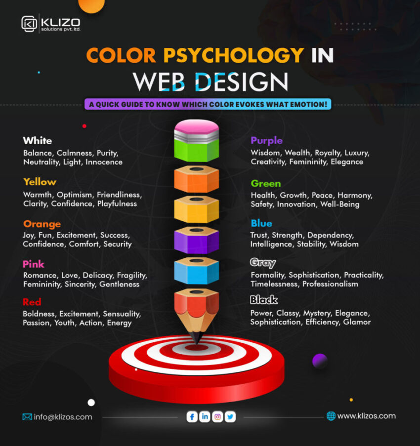
Color Psychology: The Emotional Layer Beneath The Surface
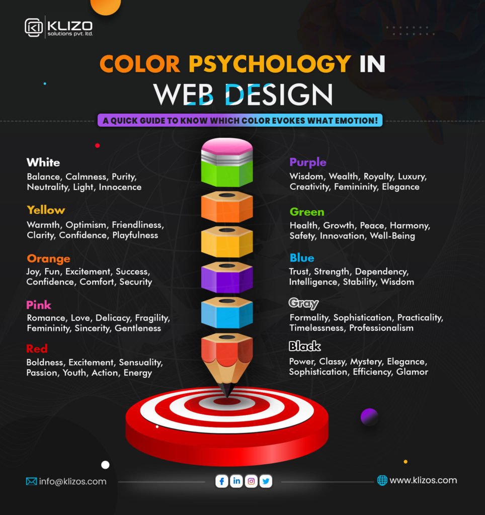
Color is the fastest communication tool in modern web design. It works before language, before logic – directly on the emotional brain.
Different colors consistently trigger different psychological responses:
– Blue conveys trust, reliability, and calm. No accident that banks, healthcare platforms, and tech giants lean on it heavily.
– Red signals urgency, energy, and action. It accelerates decision-making – which is why you’ll find it on sale tags, countdown timers, and “Buy Now” buttons.
– Green reads as growth, safety, and permission. It’s the color the brain associates with “go.”
– Orange combines the energy of red with the approachability of yellow – creating enthusiasm without alarm.
– Black and white carry authority and clarity. Luxury brands use them deliberately to signal premiumness without distraction.
But here’s the nuance many designers miss: context shapes color meaning. Red means urgency on a clearance sale. Red means danger on an error message. Red on a children’s site means fun. The same hue sends completely different signals depending on the surrounding design.
Modern web design uses color with this level of intentionality – choosing palettes that communicate the right emotion, maintaining consistency so associations build over time, and reserving high-contrast accent colors for the one or two actions that matter most on any given page. That’s why color psychology is so important for web design.
The Paradox Of Choice: Why More Options Mean Fewer Conversions
In 2000, psychologists Sheena Iyengar and Mark Lepper ran a now-famous experiment. A jam stall offering 24 varieties attracted more browsers – but the stall with just 6 varieties converted ten times more buyers.
This is the paradox of choice, and it runs rampant across the web.
Navigation menus with eight top-level items. Pricing pages with five tiers and a comparison table that needs a spreadsheet to decode. Product pages offering endless customization options before the visitor has even decided they want to buy. Every additional choice feels like helpfulness. In practice, it creates decision paralysis – and paralysis defaults to exit.
Modern web design counters this by:
– Limiting primary navigation to five items or fewer where possible
– Simplifying pricing to two or three clearly differentiated tiers with a recommended option pre-highlighted
– Single, clear CTAs per section – not three buttons competing for the same click
– Guided flows that make the next step obvious, removing the cognitive cost of choosing a path
Less isn’t just aesthetically cleaner. It converts better. The data consistently backs this up across industries.
Trust Signals: What The Brain Looks For Before It Commits
Before any visitor converts – whether that means buying, signing up, or simply making contact – the brain runs a rapid trust assessment. This happens below conscious awareness, but the signals that feed it are very specific.
Modern web design builds trust through:
Social proof. Reviews, testimonials, client logos, and case study numbers all activate social validation – the brain’s tendency to look at what others have done when uncertain about its own judgment. Specific is more powerful than vague: “127 five-star reviews” beats “highly rated.”
Visual professionalism. Inconsistent fonts, pixelated images, misaligned elements, and outdated layouts all register as signals of untrustworthiness – even to visitors who couldn’t articulate why a site feels “off.” The brain uses visual quality as a proxy for operational quality.
Transparency cues. Real addresses, named team members, visible contact options, and clear privacy policies all reduce the perceived risk of engagement. Sites that hide who they are trigger instinctive caution.
Speed. A slow-loading site communicates neglect. Studies show that a one-second delay in page load time reduces conversions by 7%. Performance is a trust signal as much as a technical metric.
Micro-Interactions: Small Moments, Big Impact
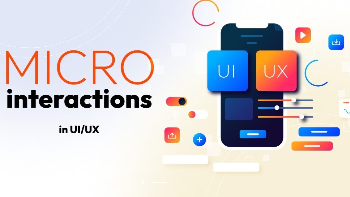
Modern web design lives in the details. Micro-interactions – the tiny animations and feedback responses that occur when you hover, click, scroll, or complete an action – do something psychologically important: they make digital interfaces feel alive.
When a button subtly shifts on hover, it confirms “this is clickable.” When a form field shakes on incorrect input, it communicates “something needs fixing” without a jarring alert. When a progress bar fills as you complete a checkout step, it activates the completion motivation – the brain’s drive to finish what it has started.
These aren’t decorative flourishes. They’re communication. Micro-interactions close the feedback loop between action and response, reducing uncertainty and building confidence that the system is working as expected. Remove them, and interfaces feel flat, unresponsive, and slightly unsettling.
Designing For The Brain, Not The Behance Feed
The most common mistake in modern web design is optimising for how something looks in a static screenshot rather than how it performs in the hands of a real, distracted, time-poor human brain.
Beautiful design and psychologically effective design are not opposites. The best websites achieve both – but effectiveness comes first. Start with how the brain processes information, what builds trust, what reduces friction, and what drives action. Then bring visual craft to those foundations.
Your visitors aren’t passive viewers. They’re decision-making machines running on cognitive shortcuts, emotional responses, and deeply ingrained behavioural patterns. Modern web design that understands this doesn’t just look good. It works – and that’s the difference between a website that earns 50 milliseconds and one that earns a customer. That’s why the psychology behind modern web design is so important nowadays and will be in the future.